Machine Empathy: How Machine Learning Can Bring Real Insight to UX Design

Combining Empathy and Data Mining for Better UX
Empathy has rightfully become predicate to good user experience (UX) design. But the means designers use to achieve empathy — such as Personas — fall short of their intended purpose.
While the motivation to use personas is noble, too often they are the product of idealized users built on demographic profiles rather than original insight sourced from real user behavior.
The limitations of personas are well understood. This recent video gives a good breakdown on the limitations while this paper from 2010 describes all sorts of pitfalls of developing personas from the process being unscientific to having a tendency towards groupthink and confirmation bias.
But should personas be thrown out altogether? By what method can priorities be made for design if there are no identified groups to serve? How is UX design to possess any empathy as is cited so often if the motivations or mindsets of the users aren’t known nor considered?
An alternative approach to empathy — incrementalism — uses behavioral data to incrementally change design toward an optimized UX. But this method, which focuses on conversion over quality of experience, inhibits innovation by making incremental improvements rather than holistic solutions.
We believe there’s a better way to approach UX challenges by matching the needs of the designer with the right data and analytical tools.
Roots of the Problem
Before we dive into the solution, it’s worth looking at the causes of how we arrived at this point:
An over-reliance on one tool, Google Analytics
Siloed thinking by using only web data for web UX
Superficial analysis of the data available enabling the HiPPO effect and leading to subjective creation of personas
The first point is the underlying cause of the other two. Expertise with Google Analytics passes wrongly for expertise in website analysis. It is Mazlow’s Hammer for website data when other sources and analytical tools are available. In short, the wrong tools and insufficient information lead to an arbitrary starting point for design.

Let’s take a simple example of a transportation information website where a key performance indicator — time on site — can be linked to opposing motivations and a false understanding of experience. In one case, a train line was down and commuters needed to use the site to find alternative routes. High time on site is linked to friction and frustration for the user in finding relevant information. Conversely, the peak-season tourist plotting her route around a city would need more time for consideration to choose how best to tour the sights.
Without grounding in an understanding of what different users are trying to achieve, well-meaning site goals can become false flags to performance.
A Better Way to Understand User Behavior
Grouping users is still essential for developing priorities in UX design, but how? It’s actually as simple as gathering more meaningful user data and using the right analytical tools and methods.
Here are our 4 steps to developing rich and meaningful user groups:
1. Take ownership of your web user data
Back in 2005 when Google acquired Urchin Software the options for web analytics were a little limited and were all paid-for or very simplistic. It would be hard to imagine how ubiquitous Urchin would become once made free and rebranded as Google Analytics. To its credit (and benefit) Google has given everyone who operates a website an opportunity to measure its performance in a easy and effective way, but unless you pay $100,000 for the premium version you cannot get your raw data out for external analysis.
Nor do you need to invest in commercial level systems like Adobe or Webtrends. Although these systems are powerful, you would be merely swapping, with unnecessary expense and time, one walled-garden for another.
Instead there are systems that are low cost or free that give rich visitor data that can be exported for external analysis. The systems we use are:
Piwik - open-source free analytics software
Opentracker - low cost software offering visitor identification
These can be installed easily as code snippets in the website master page template or in a tag manager to run side by side with Google Analytics.
Ownership goes beyond tin-hatted concepts of a single corporate entity controlling your information. While the duopoly of digital media may over time make this worry more mainstream, the main threat is that analytical tools are tied to the feature priorities of what Google and/or Facebook deem most profitable to them, not to you.
2. Think about all the external factors that influence users’ motivations and mindsets towards your site
Typically we run client workshops to map the journey of the user before they arrive at the site — and catalog all the relevant data available, including sources outside web analytics. For example, in the travel example cited above, we assembled data sets related to weather anomalies and service disruptions.
The more scenarios and user journeys uncovered, the more external data can be brought to bear.
3. Gather all the data and analyze
This is where things start to get interesting. Analysis needs the right tools and skills. Fortunately both of these are pretty abundant.
Our choices are typically:
MySQL, PostgreSQL, or SQLite for collating data held in relational databases
The statistical programming language R and its development environment R Studio
AWS to run analyses at scale
The data to be analyzed should be as flat and tidy as possible, meaning every row is a visit (observation) and every column is a descriptor (variable). If you are from the world of relational databases this may seem wasteful when the data for analysis could have millions of rows and dozens of columns. R is designed to work at scale; analysing a few hundred thousand rows can take a few seconds on a laptop. For huge datasets, prototypes can be developed on a personal computer using a data sample and the same analytical code can then run in the cloud on the full dataset.
Once the data is tidy we can use unsupervised machine learning via the ‘Cluster’ package in R. This type of analysis is used in realms as varied as medical research to pricing of cell phone packages. It may sound really complicated and a little scary, but it isn’t. The mathematics are complex, but the principle and practical execution are simple: the machine learning algorithms assign each visit into a group (cluster) by simultaneously maximizing and minimizing distances between all the variables describing the visit.
Firstly we need to know the optimal number of clusters. Trial and error can work to visually assess and get the balance of whether the resulting clusters are too similar, too different or just right. Alternatively there’s the fviz_nbclust function in the factoextra package that can give the optimal number:

The k statistic peaks around 4, hence we’ll run the functions for a target of 4 clusters.
There are a number of visualisation outputs; a popular one is using radar charts to understand magnitude of variables for each cluster.
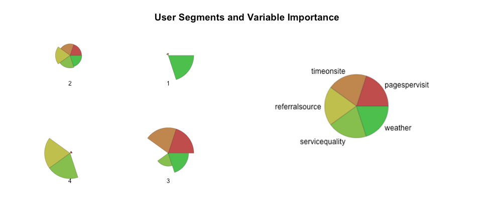
Each radar segment for this chart shows the relative importance of each variable within each cluster. A numerical output will also tell us what proportion of the overall sample is represented by each cluster, giving objective priorities.
4. Apply clusters to user groups
From the radar chart above we can interpret the clusters into meaningful segments. Even with just 2 external factors, weather and service, a greater context is brought to the three web analytics metrics.
For the above example, the segments might be:
Imperators - Bad weather and low time on site; they need information quickly
Generalists - Not quite sure as to what information they need but will take a wander around the site
Considerers - High engagement
Panickers - Referrals through from another site to check service
The above example uses only five variables — more variables can reveal more about the end users, but from the clusters available we can intuit some priorities around design:
How best to signpost specific travel and service-status content needed by panickers and imperators?
Can we provide a logical navigational structure to generalists to get them to where they need to be more efficiently?
What calls to action can best feed the engagement considerers crave?
Since every visit has been assigned into a cluster, If we serve these priorities and hence the segments, very little remains to be solved.
To restate, the more meaningful the variables we capture for each user visit, the more descriptive the clusters, and the better the conclusions about segments and briefing for design.
Synthesized Creativity or Machine Empathy?
The math of machine learning can remove arbitrary notions of what web analytics mean by combining user data with with contextual factors. But there is still plenty of need for human interpretation and creativity to color in the massive white space between the numbers. To be successful, designers and data scientists need to work together to develop meaningful insights and purpose driven segments.
Will artificial intelligence ever be able to bridge the gap between analytics and creativity? Not yet, but with each day and every improved algorithm we take one more step toward true machine empathy.