How to Build a Mobile Dashboard in Google Data Studio
Data Studio’s Mobile Problem
For a free product, Google Data Studio is a powerful alternative to premium dashboard options like Tableau. Data Studio offers all the tools you need for creating marketing dashboards: easy to use interface, solid design options, and plenty of data connectors within the Google ecosystem (Google Analytics, Adwords, Sheets, Big Query). And, with the help of third parties like SuperMetrics, you can connect to must-have data sources like Facebook Ads.
As great as Data Studio is, it fails in one key respect: mobile-friendly design. Visualizations you create for desktop view will not scale down to mobile screens.
But there’s a workaround to Data Studio’s mobile limitations, assuming you’re willing to do some work...
The Solution
These instructions should be followed from a desktop computer — Data Studio editing is pretty much impossible on mobile.
1. Create your dashboards for desktop first
Whether you’re creating a one-page dashboard or multi-page report, you’ll want to have everything finalized for desktop view first.
2. Make a copy of your report
You can only have one layout per report, so you’ll need a totally different version for mobile. All your data connectors will come over when you create a copy.

3. Plan for a one page mobile design
Data Studio allows you to create multi-page reports. This is a bad idea on mobile because the navigation controls are unusable. If multiple pages are a must, we recommend changing the navigation position to Left, rather than the default of Top. Instead, we recommend hiding navigation altogether by choosing “Auto hide” under View Mode in Layout and Theme.
4. Cut unnecessary charts and data
Screen real estate is precious on mobile. Cut down your design elements to just the key data that people are going to check when they wake up in the morning. We recommend around five charts on a mobile dashboard.

5. Change the Display Mode to “Fit to width”
Access all the Layout and Theme options by clicking on the background from Edit mode.

6. Change the Canvas Dimensions to mobile-friendly width
We like 300 x 1500 pixels for fitting about 5 nice charts.
7. Resize your charts to fit the new width
There’s no way to avoid the manual labor here.
8. Give it a test!
Send a share link to your mobile screen and check it out.
9. Edit the charts some more
You’ll probably need to edit font sizes and do some additional tweaking to get things right. We recommend 18px for chart titles, but most of the Data Studio defaults should be fine for charts. We also recommend making sure that all your charts have different color schemes to set them apart from each other.

10. Consider going with the Simple Dark theme
We think the dark theme looks a lot better on mobile, so give it a try.
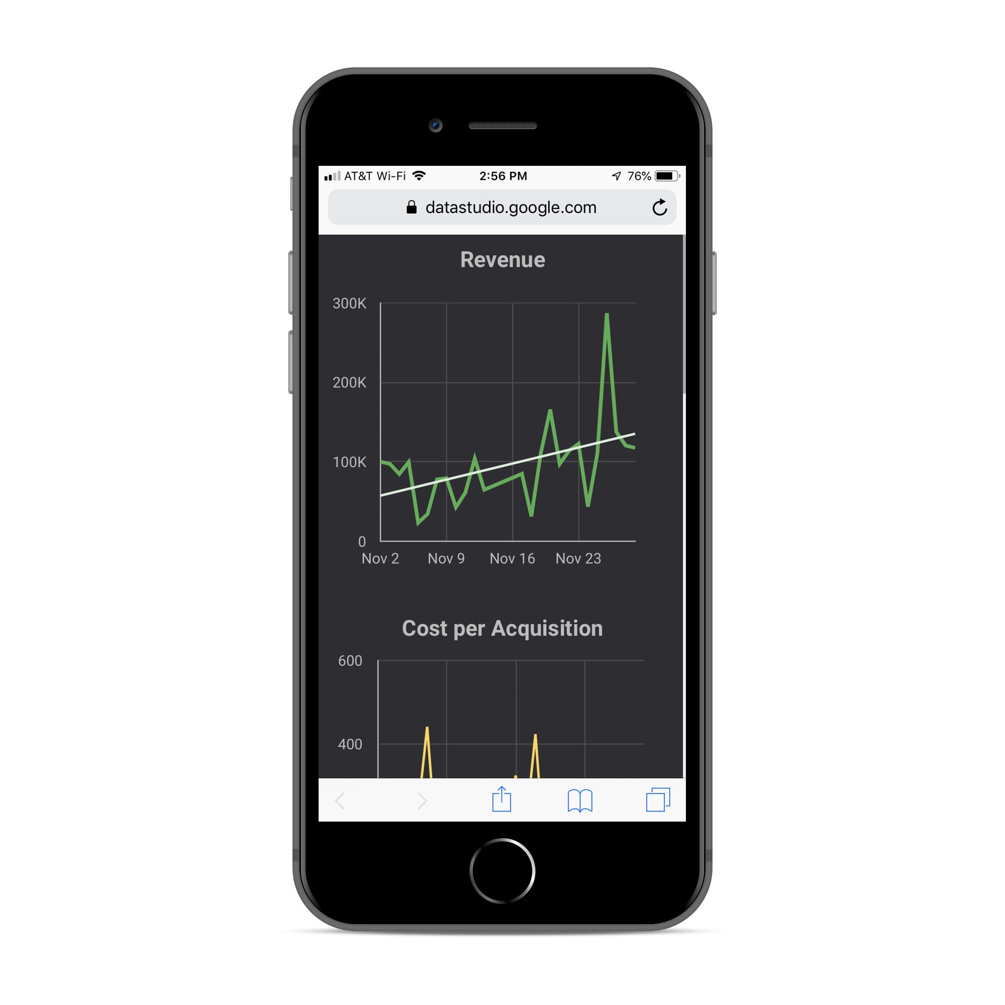
And here’s what the final product might look like when you’re all done…

Note: This article was originally published in 2018 and most recently updated in January 2021.